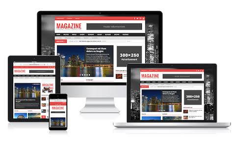
When you’ve already installed or have started using Mh magazine WordPress theme just like Naijatechnews and have started publishing awesome content, sometimes there is need for minor customizations that are beyond a standardized options panel and require custom coding. While theme customizations are beyond regular theme support, we will be sharing 16 customization to Mh magazine to make your theme smooth using common CSS customizations for MH Magazine which you can apply to your Mh magazine website theme and modify these customizations as you like.
How to inspect CSS code on your site?
In order to inspect CSS code on your site, you could have a look at the stylesheet (style.css) of your theme or your browser’s inspect tool your browser’s inspect tool which you can use to inspect the elements on your site, see how the CSS code has been applied and then use that to make your own customizations. This also might be helpful.
How to apply custom CSS code to your site?
There are several ways of how you can apply custom CSS code to your site. But one thing you really shouldn’t do is modifying the original theme files, because these changes will be lost after theme updates. To apply custom CSS code to your site, you either could use the option in your WordPress dashboard => Appearance => Customize => Theme Options => Custom CSS, install a plugin for custom CSS code (e.g. Simple Custom CSS) or make use of a custom child theme.
Custom CSS code for MH Magazine
These are examples of how you can change CSS code in MH Magazine. Feel free to use this code and modify to meet your personal requirements:
1. Center logo in header:
.mh-custom-header { text-align: center; }
2. Center menu items in main navigation:
.mh-main-nav ul { display: table; margin: 0 auto; }
3. Change the padding for items in main navigation:
.mh-main-nav li a { padding: 10px 20px; }
4. Disable uppercase letters in main menu:
.mh-main-nav { text-transform: none; }
5. Hide main navigation:
.mh-main-nav { display: none; }
6. Show header navigation on mobile devices:
@media screen and (max-width: 767px) {
.js .mh-header-nav { display: block; }
}
7. Show additional navigation on mobile devices:
@media screen and (max-width: 767px) {
.js .mh-extra-nav { display: block; }
}
8. Hide page title:
.page-title { display: none; }
9. Hide date in news ticker:
.mh-ticker-item-date { display: none; }
10. Hide category in news ticker:
.mh-ticker-item-cat { display: none; }
11. Hide tags on posts:
.entry-tags { display: none; }
12. Hide grey image placeholders:
.mh-image-placeholder { display: none; }
13 Hide one sidebar when having two sidebar layout enabled:
.mh-sidebar { display: none; }
.mh-content { width: 100% !important; }
14. Center copyright notice in footer:
.mh-copyright { text-align: center; }
15. Hide category in MH Carousel widget:
.mh-carousel-caption { display: none; }
16. Change font size within caption of MH Slider widget:
.mh-slider-title { font-size: 24px; }
.mh-slider-content .mh-excerpt { font-size: 14px; }
We will be adding more time to time.
Hope the article was helpful?
Kindly leave us with a comment below.
For more such interesting article like this, app/softwares, games, Gadget Reviews, comparisons, troubleshooting guides, listicles, and tips & tricks related to Windows, Android, iOS, and macOS, follow us on Google News, Facebook, Instagram, Twitter, YouTube, and Pinterest.


